This Visme review will be worth your time if you deal in the slightest with “visual content”.
Infographics, animations, social media graphics, visual documents, printables, etc. are just some of the things which can be created using Visme.
But wait, let me tell you what initially impressed me with Visme.
For starters, it’s used by billion-dollar companies.
PayPal, IBM, Unilever are just some of the companies who use Visme.

This right away acted as a trust-booster for me.
And then, it said it’s a tool made for designers, by “non-designers”.
This told me it probably was a tool I could use without a lot of expertise. (I’m not very good with Photoshop!)
And, I already knew how visual content is used by over 80% of the marketers to drive more conversion and sales.
I needed to get going, so I gave it a try.
I’d urge you to go through this review.
And then, if the tool fits your requirements and needs, you may go with it.
Note that this Visme review isn’t sponsored.
The goal here is to share with you my experience of Visme, and its potential in my own opinion.
At the least, it’ll help you understand and compare the tool better with its competitors.
Table of Contents
- Final Verdict- Visme Review
- Visme Pros and Cons
- What is Visme?
- 1000+ Pre-Designed templates
- User-Interface
- Professionally-designed, interactive, 100% customizable elements
- Animate any element
- Text-Editing
- Multiple share options
- Analytics and Lead Generation
- Download Options
- Visme Pricing
- Visme vs. Piktochart
- Visme vs. Canva
- Visme vs. Powerpoint
- FAQs on Visme
- #1. How long is the Visme free trial valid for?
- #2. Does Visme cost money?
- #3. Can you resell your designs created with Visme?
- #4. How to use Visme for presentations?
- #5. Is Visme better than Canva?
- #6. Is Visme better than Piktochart?
- #7. Does Visme offer discount code?
- #8. What is the minimum commitment period on Visme?
- #9. What are the payment modes on Visme?
- #10. What happens to my published and embedded content after my Visme account expires?
- FAQs on Visme
Final Verdict- Visme Review
If you’re in a hurry, here’s my personal experience and opinion of Visme.
It’s more than just “worth it”.
Initially I needed a free tool, and Visme’s free plan offered me just that.
The amount of money I save in graphic designing fee alone is a massive “yes” for me.
Despite having no designing experience, its pre-designed templates let me create sufficiently professional designs.
I’d have loved if it offered more of these templates. But if I’m being honest, the couple hundred it offers are more than what I’ll ever use.
Furthermore, I never imaged I could create professional animations, in seconds.
Visme let me do that as well. (I’ve included my first-ever animation if you scroll down).
The visually-appealing data, graphs and more importantly, the editing control over these elements is impressive.
Also, all of its icons, backgrounds, shapes, charts are 100% free. No additional payments whatsoever.
I loved how it can be used to create “anything”.
Be it E-mail headers, Business cards, Reports, Flyers, social media promo content or anything else that I’ve mentioned later in this review.
Even advanced features such as visitor analytics (views, location, time spent on page) and lead-generation are available.
I’ve previously used Canva, PiktoChart, and Powerpoint.
And honestly? Visme outperforms all of them. (Scroll down for a detailed comparison.)
However, do not rush. Do go through this Visme review before deciding if it’s worth your time.
Visme Pros and Cons
They say reviews with clear “Pros and Cons” look better, so well, let’s have them?
Pros:
- Hundreds of pre-designed templates.
- Drag & drop editor.
- 100%, granular control over every single design aspect.
- Free photo/audio and video library.
- Professional Animations.
- Multiple download/sharing options.
- Detailed analytics (visits/time spent/location etc).
- Collect viewer information (Lead generation).
- Free plan.
Cons:
- Doesn’t offer refunds.
We’ve talked long. Let’s get this Visme review started?
What is Visme?
It’s a drag & drop, visual content creator tool.
Arguably one of the most popular and established in terms of user-base.
Has 4,500,145 registered users so far.
Almost every form of imaginable visual content can be created in seconds, Including:
- Presentations
- Infographics
- Documents
- Printables
- Web Graphics
- Or Social Graphics.
- Youtube
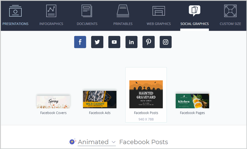
We can also choose “sub-categories”. E.g. Facebook posts, Facebook pages, Facebook ads and so on.
The pixels and sizes are auto-adjusted in this case.
What I liked is the fact that it allowed me to specify my own custom sizes as well.
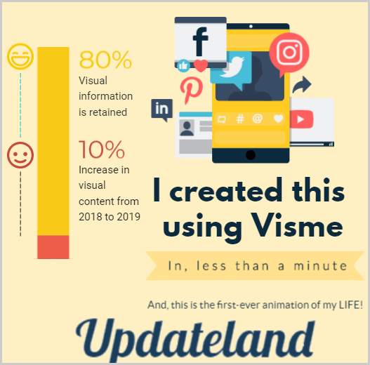
Before we start, here’s something I created using Visme.
(Click here to view animation.)
Not too boring eh? Let’s get started.
1000+ Pre-Designed templates
I’m not a designer.
But, I’m in constant need of visual content.
I’m sure some of you reading this Visme review are in a similar position?
Visme claims to let us create ultra-professional designs, in seconds, with zero-experience.
It offers hundreds of pre-designed templates to choose from.
For starters, we get to choose if we need “Animated” or “Static” templates.
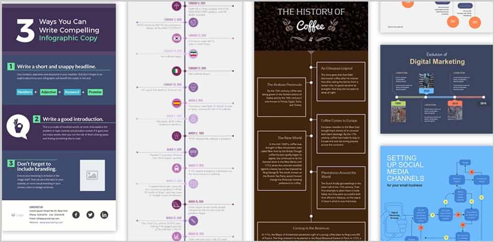
In my personal opinion, Visme comes out strongest with its Infographics.
The templates are pre-populated with all the right icons, text-placement, font and colours.
All we manually have to do is change the values. This saves us A LOT of time.
Imagine having to manually find the most-suitable icons, backgrounds, colours, styling, text-sizes and everything else?
That’s a nightmare!
Anyway, once you have your template, they can simply be clicked once to enter the editing page.
User-Interface
This is what I was most nervous about.
With near-zero graphic designing skills, will I be able to use Visme?
I asked the same question, and Visme did surprise me (with its simplicity).
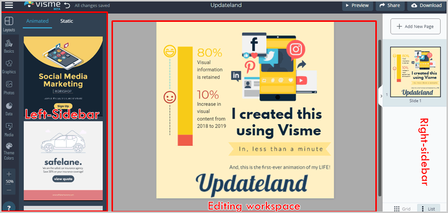
Well, here’s the user-interface that you’d see on Visme workspace:
So, the left-sidebar offers all the elements which can be added to your project.
The centre-screen is where you actually edit your content.
And the top-bar offers preview, sharing and downloading options.
It’s completely drag & drop.
We can just drag an element from the left and drop it on our design.
If you chose a pre-designed template, simply click once to edit the text.
The right-sidebar lets us add more than one slides/pages.
So basically, you can be working on more than one project at the same time.
Seems easy so far, doesn’t it?
Let’s dig a bit deeper.
Professionally-designed, interactive, 100% customizable elements
The left-sidebar offers all the elements which can be added to our projects.
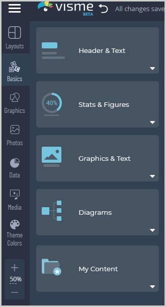
The primary elements it offers are best visible in the following screenshot:
Note that there are more elements than the screenshot shows.
And I do understand these may be a bit overwhelming.
Well, worry not.
I’ll cover each of these individually.
It’s worth mentioning that each of these element /content is 100% free.
That’s rare, most other similar tools often charge extra. (E.g. for stock photos/ music files/ icons etc.)
Layout
This is the first option you’d see on the left-bar.
It can be used to choose one of the pre-designed templates.
Or, change your current design in case you selected one you’re not happy with.
Basics
This is my personal favourite of all the elements.
For starters, we get to choose from visually-appealing data, including:
- Headers & Text.
- Graphics and text.
- Stats and Figures.
- And Diagrams
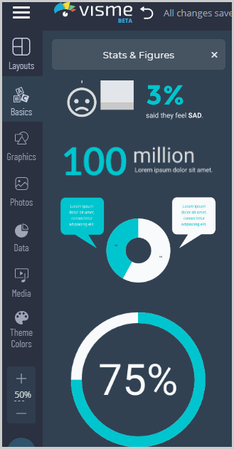
I selected “Stats and figures”, and here are some of the elements it got me:
What impressed me most was the 100%-customizability of these elements.
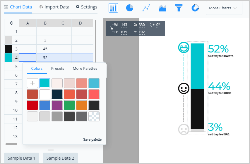
E.g. I selected an element on my project, and it lets me edit every single aspect of it.
Including the colours, exact data which I wish represented, the text and everything in between.
The chart-style too can be changed and you can choose a pie-chart, line-graph, funnel and a few other variations .
It even allows importing content directly from Google sheets.
Or, better yet, you can directly upload Excel or CSV files!
I’ve previously used a number of Visme alternatives.
But, none offer control over the graphic-elements directly, at least, not as granular and detailed as Visme.
Graphics
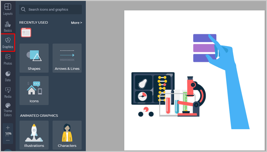
“Graphics” offers extra content which can be used to make our content more appealing.
These include:
- Shapes
- Arrows & lines
- Icons
Or, for more advanced designs, animated elements too can be added, which include:
- Illustrations
- Characters
- Gestures
(Get a leg up on the competition? Static images are too 2019!)
Photos and custom uploads
This simply holds a number of stock photos you can add to your project.
100% free. No credits required.
The current database is claimed to be over a million.
Or, you totally can upload your own photos and videos directly, simply by dropping them on the workspace.
So the one problem of searching for, or paying extra for stock photos and videos is solved at the least.
It also recently integrated “cut outs”.
These are basically outlined images, without any background. (Shoes, watches, icons etc).
Data
The name says it all, doesn’t it?
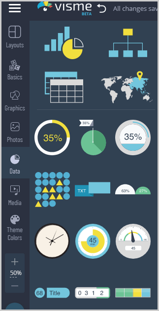
If and when you need to add “visual data” to your projects, this is where you find it.
The screenshot below shows some of the available graphic-elements for “data”:
Imagine designing one of these elements manually?
Takes hours, if not days.
With Visme, it takes seconds to drag one of these and drop onto the content. And then customize it.
Visme’s icon and data library boasts of 10,000+ icons! So, that’s quite a few options.
Media- Exclusive URL-based Embed
The next option on the sidebar is “Media”. It allows us to add audio and video to our design.
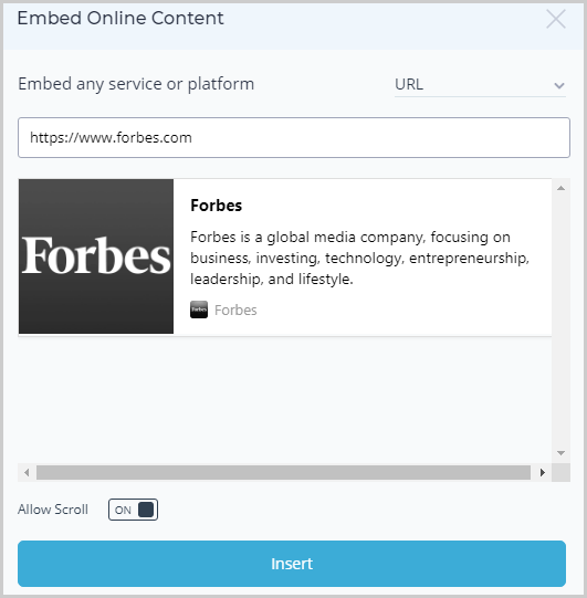
One of its options is “Embed Online content”.
This is an exclusive feature I’ve not seen any other tool offer.
Basically, we can embed “webpages” on our design.
E.g. I simply enter the URL of the page I’d like to embed.
It then generates a screenshot/snippet of the page and lets me insert it on my design.
Or, we can add audio and video from Visme’s massive database. A number of video scenes and audio clips in various categories are available.
Another happy feature is Visme allows us to “record” audio directly, in-browser.
Best for professional projects or when you need to stand out from the crowd! (How often do you see video/audio embedded graphic content on the web?)
Theme colors
It isn’t a “feature”.
And it’s not something that will make or break a deal.
Yet, it exists with Visme so I guess deserves a mention on this Visme review.
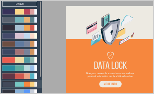
So basically, it auto-suggests theme-platelets for our designs.
If you’re someone like me, without a lot of colour-science knowledge, this is for us.
The colours are chosen by professionals (or probably an A.I).
Colours I believe create the first impression, subconsciously, whenever we see a graphic content.
This just ensures the right colour appear on our designs and not some random collection of weirdness.
Animate any element
I truly am in love with its “Animate” feature.
Not just the feature, but the ease with which it lets us animate elements.
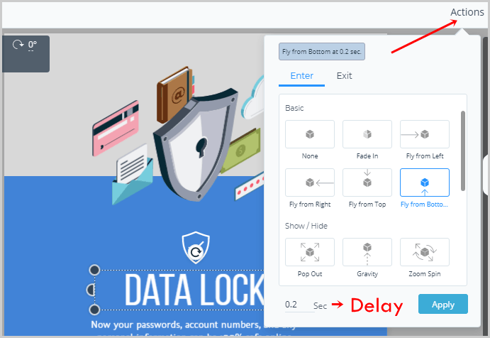
Any element can simply be selected on the design, and then we can click on the “Actions > animate” option on the top-right.
A number of effects are offered.
Simply click once and the effect gets applied to the object.
It has two separate sections for “entry” and “exit” animations individually.
Moreover, we also get to select a “delay” for the animation. This is the time after which the element animates on our design.
If and when we insert “characters” we even get to choose different “poses” and animations for the characters. These aren’t static caricatures.
Text-Editing
A lot of text will be edited on any design, wouldn’t it?
The following aspects can be edited for any text with Visme:
- Font
- Text size.
- Bold/Italic/Underline
- Alignment
- Colors
- Spacing
- Border and text-fill.
- Transformations (Upper case / lower case etc.)
Hence, just because it’s an “online editor” doesn’t mean it offers any less control than offline graphic editors. Wouldn’t you agree?
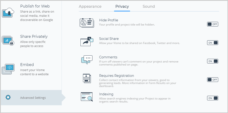
Visme allows for more than just “share on Facebook” options.
The following sharing options are currently available:
- Publish for web: This creates a link to your design. It can also be used to share the design directly on social networks, or directly make it indexable on Google.
- Private: Two options offered, either “anyone with link” has access, or only those with Visme account do. (Password protection possible.)
- Embed: The design can even be directly embedded on a number of platforms including websites.
Advanced options allow enabling/disabling shares/comments, hidden project title and profile name, etc.
You can even choose to add background music to the content! The music can be chosen from Visme music library directly without requiring manual searches or uploads.
Analytics and Lead Generation
The most advanced, and exclusive feature on this Visme review is this.
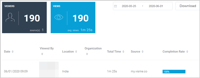
Visme is the only tool which offers detailed analytics for our projects, as well as a “Lead generation” feature.
The tool offers insights which include:
- Total visits
- Location of the viewers
- Time spent by each visitor on the page.
- Completion rate etc.
As for “lead generation”, you can use your design to collect information directly from your visitors.
If you enabled “require registration” feature on the sharing page, viewers can only access the design/content after entering their name, e-mail and organization!
Hence, this doubles as a basic leadpage without the hosting or designing cost!
Download Options
Visme offers the following download options for its content:
- JPG/PNG images. (Both HD and non-HD versions available.)
- Videos (.mp4 or .gif). Required if you created an animation.
- Editable PowerPoint presentation.
- Or HTML 5
Another “exclusive” feature I believe on this Visme review is that, I haven’t seen many tools offer the “HTML5” download option.
Visme Pricing
Before I wrap this Visme review up, let’s see if it’s priced rationally?
The good news is, there’s a 100% free Visme plan. It’s free forever and never expires.
It doesn’t require credit cards or any other such information.
Click here to get Visme free account.
Additionally, the paid plans are customized so that there’s something for everyone.
There are three primary “types” of plans:
- Individual
- Business
- And Education.
Then, each of these types have their own plans.
Individual:
- Free: $0.00/month.
- Standard: $14.00/month.
- Complete: $25.00/month (The plan I’m using).
Business:
- Single: $25.00/month.
- Team: $75.00/month.
- Enterprise: Custom plan.
Education*:
- Student: $30.00/semester
- Educator: $60.00/semester.
- School: Custom plan.
*Education plans can only be paid /semester. One semester is of 5 months. And that’s the only billing-cycle available on these plans.
On the other plans (Individual and Business) you can choose to pay monthly, or yearly. (Yearly plans offer massive discounts, nearly 50% off on some plans).
The features in each plan vary.
The number of allowed projects, storage space, access to charts and quite a few other aspects differ based on the exact plans.
No refunds are offered.
Visme vs. Piktochart
I’ll cut straight to the chase.
Piktochart offers 16 types of charts that you can choose from, while Visme offers as many as 24 choices.
Piktochart’s free plan only allows 5 active visuals (although you can delete current visuals and add more.)
However, both Piktochart and Visme display their watermarks on their free-plan designs.
You can’t directly share the design on social media with Piktochart’s free plan though.
Piktochart also only allows Google-sheet data import. You can’t manually import excel sheets as with Visme.
Interactive designs too are extremely limited, if not completely absent on Piktochart. As for Visme, simply read the “Animate any element” section above.
And then, Piktochart doesn’t offer analytics as detailed as Visme, and completely lacks the lead-generation feature.
It doesn’t allow downloading the content as HTML5 either. The direct “record audio” feature too is exclusive to Visme.
Piktochart’s cheapest plan is priced at $24.17/month. While Visme offers its lowest plan at $14.00/month.
As far as user-interface, or templates go, I’m happy with both the tools.
And there’s no “universally best template” so let’s call it a tie on this front.
But overall, I’d pick Visme any day over Piktochart.
Visme vs. Canva
Let me first establish that this Canva vs Visme comparison isn’t just my “opinion”.
I do have Canva Pro (their paid plan) as well, and this comparison is based on my personal experiences.
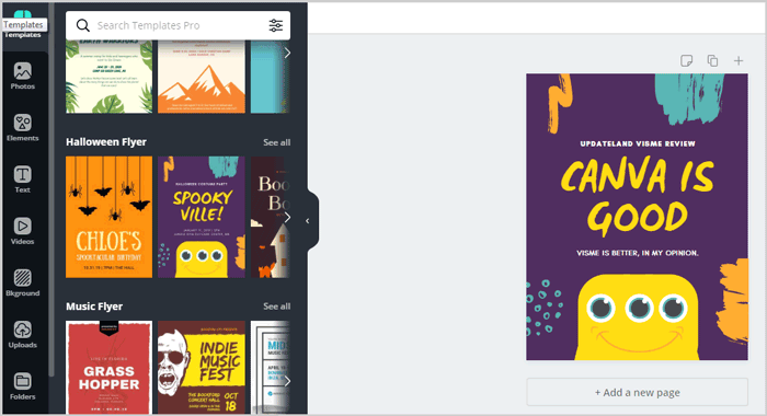
Canva is better than Visme, if “number of templates” is your only concern.
Canva offers exponentially more pre-designed templates than Visme.
However, that’s arguably the only edge Canva seems to have over Visme.
There’s absolutely no “analytic” or “lead-generation” feature.
Canva also doesn’t allow HTML5 downloads unlike Visme.
What hurt me most with Canva is its “lack of control” over the charts and data-elements.
I can’t edit the colours, sizes, and other elements in as much detail as with Visme. More of an “overall edit” is possible.
Canva’s charts and data-elements are comparatively more static than Visme’s.
While “Animated social media posts” are possible with Canva, there’s almost no control over the animation.
We can only change the text and placement, not the actual animation or effects.
Music too can be added, but the “record audio” feature isn’t available with Canva.
And again, Visme can be integrated with Excel and other third-party tools, Canva doesn’t offer as much liberty. It simply offers “copy-pasting” data which isn’t very impressive.
Canva does offer a free forever plan alike Visme.
It also is cheaper. The lowest plan starts at $9.50 as compared to Visme’s $14.00/month.
Would I pay the $4.50 extra that Visme demands? Well, I already do. For this Visme review, I’d say Visme clearly wins against Canva.
Read:
Visme vs. Powerpoint
Powerpoint can be used to create the most professional graphic content, for 1950.
Do I even need to lay it out?
Let’s start with the lack of pre-designed templates.
PowerPoint has some 30 (maximum) pre-designed templates. All of them boring and heavily saturated.
Visme on the other hand offers 1200+ pre-designed slides as of today.
Then, Powerpoint can only be used for “Presentations and documents”.
You can’t create Infographics, flyers, social media graphics, business cards, or basically anything else with Powerpoint.
The drag & drop editor is pretty limited.
The charts and data-elements Powerpoint offers? Boring!
Obviously, there’s no analytics or lead generation feature either.
However, if you need “ease of use” and “more animations/effects”, PowerPoint is the way to go.
Just a sec though, would I pay $139.00, for a 1-user PowerPoint license? Nah. Not for creating visual content anyway.
FAQs on Visme
Before I wrap this Visme review up, let’s just answer some of the most common questions related to Visme?
#1. How long is the Visme free trial valid for?
Visme free trial is valid forever.
#2. Does Visme cost money?
Not necessarily. Visme offers a 100% free forever plan. Optional paid plans are available which offer more advanced features.
#3. Can you resell your designs created with Visme?
Yes, absolutely.
Whatever you create with Visme is 100% royalty-free.
It can be resold as long as it’s not created using a non-free, or “Education” plan.
#4. How to use Visme for presentations?
Simply click “create” and then choose “Presentation”. Then, pick the slide which interests you most.
Use the drag & drop editor to add elements.
If you click on “Add new slide”, it offers “categories” you can choose from. Choose which category fits your new slide’s content best.
And then simply insert it.
Once you’ve all the slides you need, you can either download it as a PowerPoint file, or publish it on the web.
#5. Is Visme better than Canva?
Yes. It’s more expensive, but in nearly all the aspects it’s much better than Canva.
The features are exponentially better than what Canva offers.
However, Canva offers quantitatively more templates than Visme.
I’m not saying this simply because this is a Visme review. But because, I’ve personally used both the tools and this is my honest opinion.
#6. Is Visme better than Piktochart?
Yes. Visme is better than Piktochart in terms of features.
#7. Does Visme offer discount code?
No, there are no public Visme discount codes as of now.
But, if you [buy Visme now and pay yearly] you’ll get up to 50% off or even more on most plans.
Note that the exact discount depends on the individual plans. However, nearly 30% or more Visme discount is offered on all the plans.
#8. What is the minimum commitment period on Visme?
The shortest you can pay for on Visme is 1 month.
However, the “education” plans have a minimum commitment requirement of 5 months.
#9. What are the payment modes on Visme?
Credit cards and PayPal.
#10. What happens to my published and embedded content after my Visme account expires?
This is one of the most impressive aspects on this entire Visme review.
If you used the “publish on web” feature to host your content on Visme.
Or, if you’ve used embed codes to embed content directly from Visme to your website.
The content remains online and live forever. Even after your account expires.
However, “Visme” branding is then displayed on the content.
That should be all for this Visme review folks. Let me know what your take is on the tool.

