Novoresume review 2024: Is it truly the fastest, easiest and most appeasing free résumé builder? That’s what I’ll help you decide by the end of this piece.
Sure, I do have an opinion. But before sharing that with you, I believe you deserve a completely transparent, detailed and honest review of the tool. Well, that’s exactly what this entire Novoresume review is all about.
Did you know that a professionally-done résumé may help you make 7% more than what you’d make otherwise? Or that nearly 40% of hiring managers don’t spend over a minute on a résumé? Well, Novoresume claims being able to change that.
Note that I’m neither for, nor against Novoresume. I’m just a mirror into its features, potential and real-world usability. Once you’ve gone through what it offers, I believe you’ll be better positioned to make a decision of going, or not going with the tool.
Table of Contents
Novoresume Review: What is Novoresume?
It’s a simple tool which lets us create graphically-rich CVs, résumés and cover-letters with well-positioned elements and information-blocks.
It offers hundreds of pre-designed templates. We as users simply need to choose a template, customize it with a few clicks, and send it off. There also is a live-suggestion tool which helps us make our documents better and potentially more acceptable, it offers suggestions in real-time as we go on with filling the résumé.
The résumés are claimed to be designed by professional graphic designers. Moreover, the company also claims that these have been approved by recruiters. If that’s true, it basically means these résumés will hit that psychological sweet-spot for most recruiters.
And because it’s all in the cloud, your résumé always stays with you, even without having your personal computer at hand.
Here’s an overview of the tool:
- Website: https://novoresume.com/
- Pre-designed templates: Yes
- Drag & Drop: Supported (for some sections).
- Unlimited changes: Yes.
- Automated suggestions: Yes.
- Downloads: Yes (.pdf files).
- Support: Chat and e-mail.
- Free trial: Available.
Seems intriguing? Let’s get into the details.
Pricing Plans
One of the most positive notes on this Novoresume review is that, it’s completely free. Well sure, paid plans exists, and they offers more features, but the free version is completely functional as well.
Here’s the free plan: No cover letter / 1 résumé/ Pre-defined layouts / 1-page résumé only.
Note that most of the “premium/paid” features can be tried out in the free version as well. But, if such elements/features are used, the document can’t be downloaded.
As for premium plans, 3 of those are offered:
- 1 month: $16.00/month.
- 3 months: $29.99/month.
- 12 months: $89.99/month.
The premium plan include additional features such as more fonts, more colour-schemes, icons, cover letters, more pages for the résumé and the ability to create custom layouts.
Unfortunately, none of the premium plans are refundable.
Pros and Cons
Short on time? Here’s the crux of this entire Novoresume review.
Pros:
- Zero graphic designing skills required.
- Complete control and customization.
- Automated suggestions.
- Supports drag & drop.
- One-click data integration feature.
Cons:
- Only .pdf downloads supported.
- No refunds offered.
User-Interface
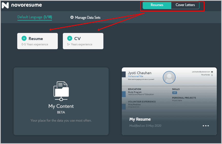
Once you login to the panel, here’s what you’ll see.
I suppose there’s not much explanation needed? The two buttons on top let us choose exactly what we wish to build. It can be résumés or cover letters.
Then, it offers additional choices and lets us choose from either a résumé or a CV. (Contrary to popular belief, they aren’t the exact same thing).
Based on your selection, the next page would look something like this:
Note that, even on this page we can change our choices. Nothing is written in stone. Neither do we need to go back to the previous page to change the selection.
And then simply choose one of the available templates for your CV. That’s exactly what we’re getting into next.
Pre-Designed templates
The company houses a plethora of pre-designed templates which can be selected and edited within seconds.
They all have their own elements, placeholders, and all of this can be customized at will. (Scroll down for details).
The one aspect which in my personal opinion hurts a bit is its lacklustre classification. E.g. the template categories are:
- Functional
- Modern
- Simple
- Creative
- Basic
- Professional etc.
In my personal and subjective opinion, these classification do not lend a lot to us as users when making a pick. The “creative” templates too are just as “modern” as the “basic” or “simple” templates and vice-versa.
Similarly, templates in all the other categories are just as professional as the ones categorized in the “Professional” category.
Template Editor
The primary selling-point that Novoresume offers is its live, easy to use template editor.
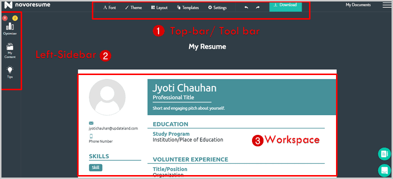
So, once you’ve made your pick for the template, here’s what greets you:
It’s categorized in 3 primary sections:
- The tool-bar (top-bar).
- The left-sidebar.
- And the workspace/centre-screen/editing area.
The Tool-Bar
This is what lets us edit the visual aspects of the elements or the entire template in general.
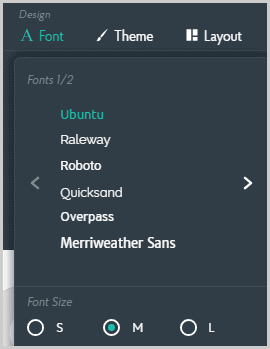
For starters, any selected font can be changed by clicking on the “font” option on the tool-bar. Currently, the tool offers 12+ fonts.
Quantitatively, it’s not a lot. But, we need to remember that we aren’t designing graphics. Rather, it’s professionalism we seek. And all of those 12+ fonts have probably been hand-picked to impart exactly that.
The font-size too can be set to either be small, medium or large.
Then, there’s the “Theme-selector”. It lets us pick an overall colour-template for the document, and a watermarked background design. A total of 20 of those backgrounds are available.
The third option on the tool-bar is labelled “layout”. Here’s what it looks like:
This probably is the core of this entire template editor. You can start out by editing your experience-level. Next, you can either make your document a single-column document or that with two columns.
Adding sections is as easy as “dragging and dropping”, literally. The available sections include:
- Awards
- Organizations
- Work
- Soft skills
- Interests
- Publications
- Teaching
- Languages
- Certificates
- Causes
- Technical skills
- And many others.
What I liked is the fact that each of these sections have their own properties. In other words, they’re not just “headlines”. E.g. in the next screenshot, I’ve combined two sections together, pay attention to how those two sections let me add different types of info to them.
These sections have been custom-tailored to make sure each section consists of the information an employer or hiring agent may seek.
Just in case you’d rather not go through all the customizations yourself, it also offers “pre-designed layouts” with various sections pre-added.
Some sections have their own unique graphic-properties as well. E.g. you can add “icons” to your “Interests” section, or “Infographics” to your “skills” section. You can even customize how individual sections display their info! E.g. the “Education” section can be made to display courses in a single row, or multiple rows.
Then there’s the “Template-picker” which lets you pick (or basically change) one of the available templates. This changes the colours, section-placement and everything else.
Again, this “error-free” editing feature is what I liked quite a bit. No matter which template you started off to begin with, the template itself and everything else can always be changed at a later time.
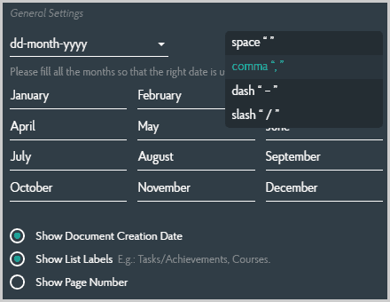
Finally, the “data-editor” is what lets us customize the documents’ core-data. As in, “date/month/year” format, commas, dashes, and name of the months (just in case you’re from Jupiter, or well, need a CV closer to your local language).
You also can adjust the spacing of the different sections/elements using a percentage-based scale just below the top-bar.
I believe so far in this Novoresume review, we’ve covered everything that the tool-bar on top offers? Let’s move onto the left-sidebar then.
It consists of the following options:
- Optimizer
- “My content”
- And Tips.
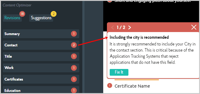
So, the Optimizer basically offers “Revisions” and “Suggestions”. In case the document requires something more, the optimizer points it out. It also offers tips on how to make a certain section more acceptable (both to the human brain, and automated ATS systems). The following screenshot should explain things better:
The “Suggestions” are basically the same thing as revisions, but they’re generally “optional” and not of paramount importance. E.g. it recommended me to add a social media profile. Not doing so doesn’t mean my CV will get auto-rejected by the ATS systems.
The “tips” button is more of some “generic knowledge”. It suggests reading the job-ad carefully, matching action-verbs to the ad and so on. If this is your first time crafting a CV, these can help you make better CVs just the way more experienced applicants do.
There also are video-instructions on how to make things better!
“My Contents”
This too is an option on the left-sidebar. Or, you can also find it when you first click on “Build my resume” (refer to screenshot #1).
So this basically is your “drawer”. Or, a centralized collection of all your skills, titles, abilities, degrees etc.
Once you fill this up, you can simply insert the details on hundreds of CVs on Novoresume without having to type them in manually.
It lets you save the following details for later and repeated use:
- Header (It contains basic data such as Job Title, all the contacts, summary etc).
- Practical (It’s basically for experiences, teaching, volunteering, projects and everything else).
- Abilities (Lets us list technical skills, languages, soft skills etc).
- Recognitions (the deserved show-off sections, list your awards, achievements, references etc).
- Personality (tell the employer who you are, add interests, causes, organizations you associate yourself with).
- Theoretical (The paperwork, lets you add your education, conferences, courses, certificates etc).
Whenever you’re editing a document next on Novoresume, simply select “My contents” from the left-sidebar, and add your info in just a single-click! It’s automatically added to the exact section on your CV/résumé where it needs to go.
In my opinion, this is what grants Novoresume a slight edge over its competitors. Even if you were to create half a dozen different CVs, for half a dozen different jobs, the time-required to get those CVs done is reduced to a fraction of what it would otherwise take without the “My contents” feature.
Multiple Versions & Downloading Feature
Novoresume allows us to create multiple versions of the same résumé/document. This helps keep the primary version safe and untouched, while we get to play around with the duplicates.
Also, if you’ve really struck the chord with a theme/colour-profile, layout etc. this allows the creation of multiple CVs, with different information but identical appearances.
The one major problem for me personally with Novoresume is its download-feature. It allows downloading the completed résumés only in a PDF format. While that’s totally the most commonly used doc-type for such purposes, I’d have been happier if JPG, PNG or other formats were supported as well.
Support
In case you get stuck and need help understanding or fixing things up, the company does offer support.
There’s a live-chat feature, however, it’s not exactly 24X7. The replies take a few hours.
Fortunately, from inside your accounts, you get access to tons of detailed videos on how to get things done on Novoresume. This limits the number of times you’ll need the live-chat to begin with.
Although, if you do need support in addition to the live-chat, the team can be contacted via e-mails as well.
Novoresume review: Final Verdict
So this is me signing off this Novoresume review folks. As for my final verdict, well I’m pretty neutral. Neither too hyped up, nor too disappointed.
The green lights for the tool include its arsenal of pre-designed templates, customization-abilities, and ease of use. It takes seconds for someone with zero editing/ resume-building experience to come up with an ultra-professional, eye-catching, and potentially job-landing résumé.
There are factors which didn’t impress me though, e.g. the lack of multiple download formats, or the fact that the spacing-interface isn’t exactly drag & drop. Using the percentage-based scale limits the movement or distancing that we can achieve for each individual section. This also makes it impossible to place
All in all, I’d say the tool isn’t a disappointment. If you’re a graphic designer, or an applicant yourself, the very least you can do is give it a try. The free version helps you make an experience-based decision, that’s a bit more than this Novoresume review can offer.
