In this Boxmode review, I will discuss all the primary features and problems that the company brings with itself.
Can you truly create a website in minutes, if not seconds? Is it truly 100% free? Can you create the website with absolutely 0 web-designing skills, experience or knowledge?
Well, the company certainly claims so. Are these claims true? We’ll see.
Table of Contents
What is Boxmode?
Five words – Free, drag & drop, website builder.
I believe they define Boxmode best. It’s a website builder which lets you select a template > edit text > add images > done. That’s literally what’s required to build your website. Don’t even think of coding. In fact, as far as my experience goes, I’d say it seems easier than designing a PowerPoint presentation.
You don’t even need to buy a domain or server. It provides a free domain and hosting! In a nutshell, a free website builder Boxmode truly seems to be.
But hey, don’t let me influence you. Do read this Boxmode review and then decide for yourselves.
Boxmode review – Final Verdict
Here’s what I personally think of Boxmode – it lets me build a website, with 0 prior website-building experience or knowledge, in minutes, for free. The interface is completely drag & drop. The editing control over the elements is impressive.
And then, there’s free publishing (free domain and hosting). However, it’s still a pretty new project and has quite a few areas which require improvement.
For one, the current “widget-library” is lacking. Only a couple of variations for each widget are available.
Secondly, it would help if there was an in-built stock image search option. But all in all, if you just need a responsive website, fast, Boxmode will more than make you happy.
Pros and Cons
Let me sum this Boxmode review up in a few sentences?
Pros:
- Extensive Pre-designed templates library.
- Easy drag & drop interface.
- Truly free (building + publishing).
- Ultimate control over elements.
Cons:
- No font-preview before applying fonts.
- Fewer widget-variations available.
Boxmode Pricing plans
Hey, ease out, you aren’t spending a penny. Well yes, there’s a 100% free Boxmode plan.
Here are both the plans that Boxmode offers:
- Free: Free website creation + publishing, free subdomain, Boxmode branding.
- $33.00/year – Custom domain, 5GB Storage, Chat support, No Boxmode branding/watermark.
My personal take on the pricing? It translates to $2.77/month. For the ability to get my website live in minutes (literally), I don’t suppose that’s an unreasonable price, do you?
No mandatory registration
This I loved the most – one-click access to the website builder. The company didn’t seem hungry for my email, unlike almost every other online platform today.
I land on the site > click on “Start for free,” and I can actually, truly start building my website.
Pre-designed templates
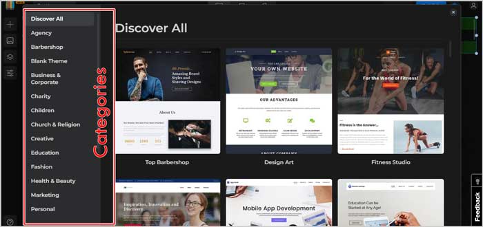
The very first step you’ll see when you start using Boxmode is a list of pre-designed templates. What’s best? Choose from one of the many categories available on the left sidebar.
Most commonly used categories are available, the options include:
- Charity
- Children
- Marketing
- Personal
- Sports
- Technology
- Pets
- Real Estate, and many others.
This makes sure that even with 0 design-knowledge, you’ll still choose the right template.
Boxmode user Interface
Once you’ve selected a template, let’s start with the user interface? Can you use Boxmode if you’re an absolute beginner? This your first website, maybe?
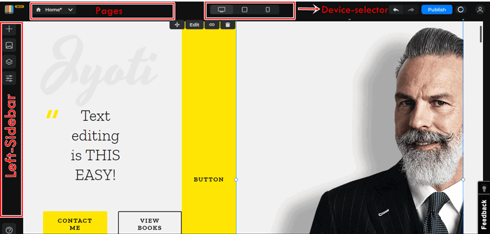
Well, here’s what the website builder looks like (regardless of which template you choose). The elements sure will be different, but the overall interface remains the same.
Being honest, I don’t suppose it actually requires an explanation. But well, let me try and make things simpler anyway.
So, there’s a toolbar on the extreme left. This bar holds all the important features, such as widgets, layers, CSS panel, etc. (What are those? I’ll explain, keep reading).
The top-bar then offers the device selector. Choose to preview your website for different devices (PC/ iPad/ mobile phones). The top-bar is how you access and edit other pages, publish the site live, or access your account.
The most important section, however, is the centre-screen. Or, it can also be called the workspace. This is where you actually edit your website. How hard is it? Do you know how to type text? How to drag something on your screen?
If you do, you already know how to build a website using Boxmode. You literally can select any text and edit it as easily as you edit content in a notepad file or MS-Word. Drag and drop the elements (images/text/widgets) anywhere you want to place them. Or obviously, add your own elements.
As far as the UI goes, I don’t suppose it could be any simpler. Although, if I’m being honest, I did notice a bit of lag while dragging elements. It’s not a deal-breaker and may be due to my system’s hardware. But well, it’s just my experience.
Editing the elements
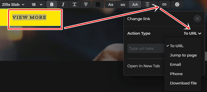
That’s what you’ll be doing most of the time, right? Changing the default template elements, or adding and editing your own. Let’s see how good (or not good) the editing features are? Well, whenever you click on an element, an edit-bar like this one will pop up:
So, it offers:
- A font list*
- Size
- Formatting (Bold/Italic/Underline/Strikethrough)
- Colour
- One-click capitalization of text.
- Alignment, and
- A CTA-trigger (scroll down for details).
*Probably, the only aspect I’m not happy about is that its fonts don’t offer a “preview” before selection. Meaning, you don’t know what a font will look like before selecting it. Only after applying it to your element, you’ll see the results. The font-list, however, still is extensive and impressive.
Selective Editing
I honestly loved this. It offers “selective editing.” That’s extremely rare, even for drag & drop website builders. Meaning, you can select a text-block, the entire sentence, and choose to apply different edits (font/size/color, etc.) to different parts of the same sentence.
(Hint: Look at the sub-heading in the screenshot above).
I did say it holds everything important, didn’t I? Well, this is what it looks like when expanded:
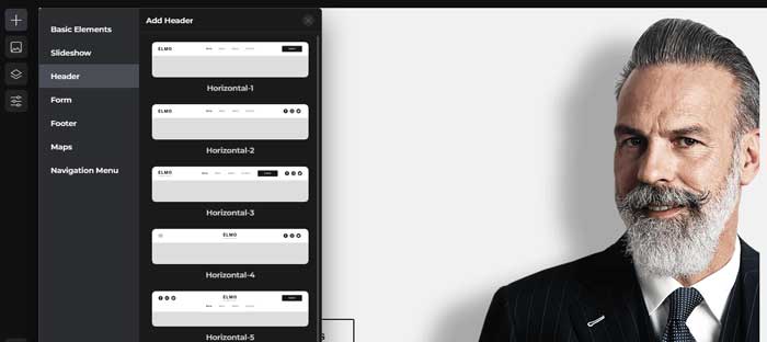
The “+” sign is the “add widget” option. So, this is where I select what I wish to add. As is evident, I can add:
- Headers,
- Slideshows,
- Forms,
- Footers,
- Map, and
- Navigation menu.
Now, if I wish to add a form, multiple variations of available forms are presented:
Similarly, you can click on any other widget and then choose from one of the available variations.
Basic Element
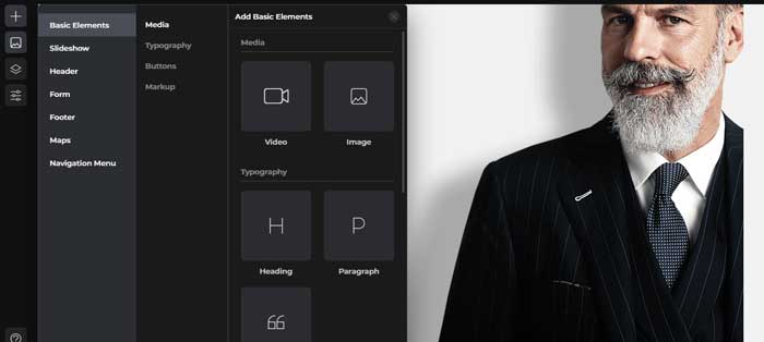
This, too, is a widget I can add. However, it has sub-categories of its own and hence is being mentioned separately.
As the screenshot shows, I can add:
- Media (video/images);
- Typography (heading/paragraph/quote);
- Button; and
- Container.
I only have to drag any of these elements to the workspace to add them to my website!
Layered Editing
It’s the third option on the toolbar. Quite frankly, this isn’t something I’ve used much, neither do I need to. It simply displays the Div tags and the elements they contain. One of its only uses to me was that I can use it to find elements faster by searching for them, instead of having to look manually.
CSS Panel
Now this is interesting. A website isn’t just about placing elements, is it? The CSS panel gives me a lot of control over these elements. Here are the options:
I won’t go into the details (because this is a Boxmode review, not a tutorial) but, I’m sure you’ll get an idea.
I get to edit:
- The layout,
- Display,
- Flex,
- Background,
- Typography, and
- Adjustments (positioning, shadow, radius, border, etc.)
All in all, it does get me quite a bit of control over the exact appearances of these elements.
CTA Actions
Nearly everything on the editor can be made into a CTA trigger! Meaning, the element (text/image) when clicked will trigger some kind of action. You can make a click:
- Redirect to another URL,
- Initiate an Email,
- Initiate a download, and
- initiate a phone call.
Free publishing / hosting/ domain.
A website needs to go “live,” right? Boxmode did impress me once again. It offers a free “.site.bm” domain extension. Well yes, that’s not very professional, but hey, it’s free. More importantly, this makes the process pretty easy for first-timers.
You don’t have to buy a hosting account or a domain and then mess with the DNS settings, nameservers, and everything else that generally goes into making a domain live.
At the least, this free domain gives you a live preview mode. You can show it to your friends and colleagues, get feedback, and basically improve it. Once you’re done, you can totally connect it to a custom domain of your own as well.
(Publishing the site does require registration, it’s free).
Favicon, Sitemap, and Robots.txt edits
Despite being a free domain, you’re not entirely without control. For starters, Boxmode does allow adding a favicon. Get some professionalism, eh? You can also edit the robots.txt directly from your Boxmode account. And finally, the sitemap too can be edited for better search engine crawling.
Responsive Design
For the last section on this Boxmode review, let me just say that the templates are 100% responsive.
You did notice those device-selectors on the top-bar, didn’t you? They let you preview or make your site for different devices. Why is this important? Well, Google prioritizes mobile-sites (and your users do too).
And with that, I wrap this Boxmode review. Is Boxmode worth it? In my opinion, it’s free and feature-rich. So, yes. But I’d love to know what you think.
